
IELTS Academic Writing Task 1 Sample 2
Instructions:
We constantly see looks of confusion in the students we are helping prepare for the IELTS in regards to responding to Task 1 in the IELTS Academic Exam. I felt the same way when I saw a sample Task 1 question a couple of years ago. We want to help demystify the IELTS Academic Task 1 question and give you the confidence you need to score well.
We wrote an in-depth article about "How To Write IELTS Academic Task 1." If you haven't read that, please read it now. This sample will show you how to take the method we outline in that article and apply it to a graph or chart.
Step 1 - Read the instructions carefully:
Part of scoring well is fully responding to the question given with the chart or illustration. If the rubric only asks us to describe the chart then that's what we need to do but if the rubric asks for main features and comparisons then we need to make sure we include this information.
So our task looks like this:
You should spend 20 minutes on this task:
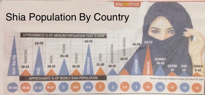
The chart above shows the Shia population by country compared to other countries and the world's total Shia population.
Summarize the information by selecting and reporting the main features, and make comparisons where relevant.
You should write at least 150 words.
So, by reading the question we identify our task by looking at the verbs: summarize, report, compare. So our task response should include these ideas.
Step 2 - Observe Important and Significant Information:
When we observe the graph we need to answer some basic questions to get us thinking in the right direction.
1. What is the title of the chart/illustration?
- the basic title is "Shia Population by Country" and we see two additional titles indicating that the triangles represent the percent of a countries Muslim population that is Shia and the circles indicates what percent that country's Shia population is in regards to the world's total Shia population.
2. what are the measurable values?
- it's important to note that we are working with percentages and not whole amounts. This means we will need to use vocabulary that relates to proportions and fractions as well as percentages.
- % of a country's Muslim population that is Shia
- % that a country's Shia population is of the world's total Shia population
3. What are the noticeable trends?
4. What are the prominent features? (The things that stand out)
- This is the tricky part. Identifying the trends will help us structure our answer. So we need to identify and then group our trends together. Please note, there is more than one way to do this. So, some of the noticeable trends include:
- 4 countries hold 80% of the world's Shia population
- 5 countries each contain less than 1% of the world's Shia population
- Iran, Iraq, Azerbaijan, Lebanon and Bahrain of high percentages of their population that are Shia.
- 9 countries have relatively low concentrations of Shia populations (15% or less).
As you can see, this is a fair amount of information and we couldn't possible describe or talk about all of it. For simplicity's sake we have decided to focus on the 4 countries that represent the largest portion of the world's Shia population and make mention of the other 12 nations and how they compare.
Step 3 - Write the Introduction:
Now it's time to take our collective information and start writing. We should start by introducing the graph and describing what we see. This is often done by paraphrasing the rubric or title of the chart. Remember, you do not want to copy the rubric or the title but reshape it into your own words. Our title is not very helpful but combined with the rubric we could introduce or Task 1 response like this:
The graph depicts the percent of the Muslim community that is Shia in 16 different nations and what percent of the world Shia population that number represents.
So, some of our concepts don't have good synonyms, for instance, the word Shia or Muslim. But we have used 'community' in place of 'population' and 'nation' instead of 'country.' We have also included the necessary information that this graph shows information of 16 nations.
Step 4 - Summarize the Main Features or Trends:
Now that we have our introduction we want to make a broad overview of what the chart depicts. This should only be 1-2 sentences:
The graph indicates that eighty percent of the world's Shia community lives in just four countries. The remaining fifth is spread out over next twelve countries.
Notice that our overview indicates how we will structure our response. Based on this statement I want to write one paragraph on the four countries that comprise 80% of the Shia population and a second paragraph summarizing the remaining nations.
Step 5 – Give the Details of the Chart:
Now we are ready to get more specific. We need to make sure we use the data from the graph and be specific when necessary but we don't have to give 100% of the details. We will follow the main ideas that we set in our summary. So our first paragraph will focus on the top 4 nations like this:
Iran tops the chart for both the percent of its population that is Shia and for having the largest percentage of the world's Shia population. The population of Iran that is Shia is roughly 90-95 percent which represents nearly forty-percent of the world's total Shia population. Surprisingly, Iran is followed by Pakistan which has up to fifteen percent of the world's Shia community but that number represents only a small amount of Pakistan's Muslim population at just over a tenth. Iraq is similarly surprising in that its Shia community is approximately 70% of its population but only a tenth of the world's Shia population. The last of the four chart topping countries is India with a little over ten percent of the world's Shia population which represents approximately the same amount of India's Muslim population.
Notice that we have used a variety of ways to talk about the numbers. This is important. Practice writing percent and fractions and don't be afraid to round up or down using adjectives like 'over,' 'under,' and 'almost.'
Our second paragraph is a little more difficult because we have left ourselves with a lot of information. We want to continue to focus on the percent of the world Shia population like we did in paragraph 1 so that there is good flow and cohesion to our writing.
On the other end of the spectrum are five countries Oman, UAE, Qatar, Kuwait and Bahrain whose Shia community each represents less than one percent of the world's Shia population. Lebanon and Saudi Arabia follow closely behind with one percent and Afghanistan and Syria only minimally higher at two percent. Azerbaijan, Turkey and Yemen complete the chart with approximately three, four and five percent of the World's Shia population. It is worthy to note that while the percentage for the world total of Shias is low, Azerbaijan, Bahrain and Lebanon show that Shia's make up more than half of those countries Muslim population and up to three quarters for Bahrain and Azerbaijan.
Let me say again that there are multiple ways of writing this information. Even as a native English speaker and writer I found it difficult to identify the main features and might even lose points for sharing too much information. However this gives the reader everything they need to recreate the chart without ever seeing the original and demonstrates a wide range of grammatical structures including relative clauses and passive constructions.
If we combine all of our parts into one our answer will look like this:
Answer:
The graph depicts the percent of the Muslim community that is Shia in 16 different countries and what percent of the world Shia population that number represents.
The graph indicates that eighty percent of the world's Shia community lives in just four countries. The remaining fifth is spread out over next twelve countries.
Iran tops the chart for both the percent of its population that is Shia and for having the largest percentage of the world's Shia population. The population of Iran that is Shia is roughly 90-95 percent which represents nearly forty-percent of the world's total Shia population. Surprisingly, Iran is followed by Pakistan which has up to fifteen percent of the world's Shia community but that number represents only a small amount of Pakistan's Muslim population at just over a tenth. Iraq is similarly surprising in that it's Shia community is approximately 70% of its population but only a tenth of the World's Shia population. The last of the four chart topping countries is India with a little over ten percent of the World's Shia population which represents approximately the same amount of India's Muslim population.
On the other end of the spectrum are five countries Oman, UAE, Qatar, Kuwait and Bahrain whose Shia community each represents less than one percent of the world's Shia population. Lebanon and Saudi Arabia follow closely behind with one percent and Afghanistan and Syria only minimally higher at two percent. Azerbaijan, Turkey and Yemen complete the chart with approximately three, four and five percent of the World's Shia population. It is worthy to note that while the percentage for the world total of Shias is low, Azerbaijan, Bahrain and Lebanon show that Shia's make up more than half of those countries Muslim population and up to three quarters for Bahrain and Azerbaijan.
If you can apply the same ideas to your Task One responses you can achieve high results in this portion of your IELTS Exam. If you need help, leave your questions and comments below or check out our IELTS Preparation Class:

Related Articles

IELTS Listening Resources

Academic Word List - Group 10

Academic Word List
Category List
Writing (1)
Listening (4)
Grammar (5)
IELTS & TOEFL (23)
Interview & Group Discussion (2)
Pronunciation (6)
English (3)
Vocab Display Page (6)
Speaking (10)
From the Blog
-

IELTS Listening Resources
19 Jun, 2018| by adminGet tips, hints and suggestions plus lots of practice for the IELTS Listening Exam. Practice online or download the material so …
-

IELTS Speaking Resources
17 Jun, 2018| by adminFind our more about the speaking section of the IELTS Exam and get practical help learning how to answer common questions and to…
-

Academic Word List
16 Jun, 2018| by adminView, download and study the AWL or Academic Word List which includes nearly 600 of the most used words in Academic settings. A …